More on the Super Mario Room

First, the response and all the compliments have just blown me away. Thank you all so much. Second, my wife was a huge part of this. I couldn’t (wouldn’t) have done this without her help. I wanted to mention that because I’m seeing posts like this one at Curbed.

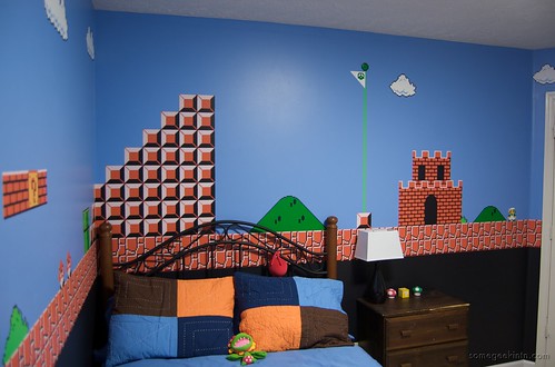
There have been some questions about how exactly we did this. The background colors were easy enough, 35″ of black along the bottom, an 8″ orange stripe, and blue above. We very nearly stopped there after realizing how much work we were in for, but once I figured out the stencil thing we decided we might actually be able to pull this off before our son was of, say, legal drinking age. To make the stencils, I used two sheets of clear 8.5″ x 11″ labels. 1/4″ per pixel gave me just enough room for 32 x 32 “pixels” on each sheet. I printed the various patterns on these sheets, stuck the sheet with the pattern on top of another and then cut the patterns out with an X-Acto knife. I also printed some guidelines on the sheets to help with alignment. Each sheet could be used maybe 50 times or so before they became too caked with paint and had to be thrown away.

In some cases patterns had to be broken into two templates to avoid ending up with just an outline. For example, for the clouds there was a top part and a separate sheet for the bottom part. For the ground, there were four templates. One for black horizontal-ish lines, another for vertical lines, and two others for the horizontal and vertical highlights. Other templates (like the bricks) left small gaps where I’d have to come back later and paint freehand… you know, perhaps this would make more sense if I made the template available: Mario Photoshop Template.

There were several mistakes. Some intentional. Some not. Someone actually noticed that I’d painted Mario’s shirt sleeves and boots blue instead of brown. I did that intentionally since my son finds that more recognizable. Also, Luigi wouldn’t normally be waiting for Mario on the other side of the castle, but Aaron likes Luigi and I had to put him somewhere.

As for the unintentional mistakes, the flagpole is too far right by 16 pixels. Sadly Mario could never manage 5,000 points on my map. I was going to correct it, but my wife told me I was crazy. The hill to the right of the castle is squished, and the one to the left is 1 pixel too wide. Other than that, I think it turned out pretty good.

This Year’s Stupid Idea

I really need to learn to think through these ideas I have before committing to them. Last year I had this built-in bookcase idea that I was going to knock together in a few weekends. The year before I was taking a picture every single day. Something equally nutty the year before that I”m sure. And now this year… well, you’ll see.

We’ve been slowly trying to fix up the house a bit at a time over the last year or so (remember the bookcase?) and when talking to my wife about what to do with my son’s room I blurted out something about a Super Mario Bros theme. I didn’t really think about it, except that it would be cool. There was a post on reddit awhile back showing someone who had done just that, and it looked pretty awesome. When the time came to actually paint his room, my wife reminded me of the Super Mario Bros idea and then I actually had to think about it. I seemed to recall ThinkGeek had some decals, so maybe I could use those, or maybe paint it. But first I’d need to figure out exactly scene I wanted to portray.

I really wanted to map World 1-1 of the original game onto the walls. Originally I thought I would take a small section and paint that on the walls from floor to ceiling. Turns out that wouldn’t work so well because most of the interesting bits are on the bottom where they would be concealed by the bed, desk, dresser, etc. Then I struck upon the idea of painting a border along the bottom so I could scale the scene down and fit more of it on the walls. I worked it out so each pixel would work out to 1/4″ square and my scene would be 232 (58″) pixels tall by about 2060 pixels wide (515″). Since the vast majority of it was sky, it surely wouldn’t be that much work, right?

Super Mario Bros. Room

So we got to work and quickly had our three background color painted: black on the bottom, an orangeish stripe along the middle that would be the ground, and the blue sky above. The next day we’d pencil in a grid and start painting pixels. I assumed that because reddit guy had penciled a grid across and entire wall that I would have an easier time since I didn’t have to fill the whole wall, just the bits I needed. Well that guy was working with a much simpler design and 1 inch pixels. It didn’t take long before I began to reconsider those decals.

Each $50 pack of ThinkGeek decals look to have about 8 of the ground blocks in them. If I figured right, I need about 170 blocks. Or about $1,100 worth of decals. Even then I probably wouldn’t be able to recreate my World 1-1 scene exactly. But what if I made my own decals? Maybe I could print my patterns on some clear labels and stick those on the walls? Even if the labels had been clear, the ink would have smeared unless I applied some sort of clear coat, so that idea was out. My next idea was to create masking templates using those same labels and go back to the painting idea.

It certainly wasn’t going to be very fast, but the template idea worked pretty well. There were several of set backs, and several areas had to be painted freehand, but after about 3 weeks of work, we finally finished the room. It has a ton of mistakes (that I won’t bother to point out), but all in all I think it turned out really well. Now if I can just avoid blurting out any more ridiculous ideas.

iPhone Wallpaper

CPU Wallpaper w/circuits
Mmm, circuity.

Sometimes I get a thing stuck in my head and I just have to take care of it before I can do anything else. I’ve been wondering what a circuit board background would look like on my iPhone for several days and I finally just had to make one and see. I’m sure someone else out there has already made something like this (and better), but it didn’t occur to me to look until I was about halfway done.

I made two variants. I did one with just CPUs so I could make sure everything lined up the way I liked, then I did another with resistors, and caps, and vias, and little traces, the whole enchilada. And now I can’t decide which I like better. The circuit board variant may be just a little busy. The CPU only version is nice, clean, minimal. I like that. I can’t decide…

Anyway, I put them up on flickr. You can grab them there if you like.

Secrets of PowerMate 3.0

It’s taken a while, but PowerMate 3.0 was finally released today. I thought I’d take a moment to talk about some of the features that may not be obvious right off the bat.

MENUS

One of the most noticeable new features of PowerMate 3.0 are the fancy radial menus. There are several pre-built menus. They’re pretty self-explanatory, but I’ll go over them real quick here. The Applications Menu is the simplest. It displays all the running apps and lets you quickly switch between them. The Contacts menu shows you all the contact info for the entries in your Address Book and lets you email, chat, or map that contact’s location. The iTunes Menu is the most detailed. It lets you play, pause, jump to the next or previous track, rate the currently playing track, and it displays your music organized by genre, composer, albums, artists, and playlists. You can navigate down through each of these refining what is being viewed as you go. At certain levels, such as a particular artist or genre, you can play all the tracks in the selection, or play the “best of” a particular category. “Best of” includes all those tracks that are rated 4 stars or greater.


Menus in PowerMate 3

The real fun (I think) comes from Custom menus. Custom menus can be added to any trigger and they can contain any number and any kind of PowerMate action. Rather than having a trigger for several different menus and having to remember the modifier keys for each, I’ve got everything in one “mega” menu. And I’ve grouped those actions I think are most important towards the beginning (assuming an oval can be said to have a beginning). Check the video. App launchers towards the beginning, an Applescript to open up the keyboard viewer, the Apps, Contacts, and iTunes aren’t used as often but they’re in there and a submenu with several bookmarks. I’m constantly adding to this menu whenever I find myself thinking “I wish I had a handy way to do X”.

SAVING SETS

One of the things that may not be totally obvious is the ability to save your Sets. This might come in handy for sharing your fancy configurations with friends. And it’s not a bad idea to have a backup in case your settings get hosed somehow. To do this drag a set (or sets) to the Finder. To restore, double click or drag a pmset file into the item list. That’s pretty much it. One thing to keep in mind when saving a set: any external resources such as files, apps, etc., that are referred to in your triggers, aren’t saved with your set. Maybe that’s obvious, but if there is a reference to an app or file that doesn’t exist on the machine where the set is restored, well, it’s not going to launch that app or run that script. For this reason, it’s always better to enter an AppleScript directly into the PowerMate app than referencing an AppleScript file.

LIGHT STATES

While the default light state controls found in a Set are pretty obvious, the Match Light State check box found in the Trigger inspector may not be. What I’ve done is added the ability to control the PowerMate light via AppleScript. It’s not quite as straightforward as just telling the light to blink or pulse however. Instead, you create something called a light state and give it a name. You can find examples in the Extras/Scripts folder on the PowerMate disk image, but in its simplest form creating a light state looks like this:

tell application "PowerMate"
 set aDevice to first device
  tell aDevice
   make light state with properties ¬
    {state type:counter, pulse count:3, pulse length:0.15, name:"Alert x3"}
 end tell
end tell

What this does is create a counter style light state that will pulse 3 times with each pulse lasting 0.15 seconds. It will pause between each set of pulses and repeat the cycle. And the important bit is the name: “Alert x3”. We can now set up a trigger that will only execute if “Alert x3” is the active light state by checking Match Light State and typing Alert x3. (Note: the default light state is called “Default”. You can match against “Default” if you only want to trigger when no custom light state is active.)

If you look in the PowerMate scripting dictionary, you’ll see that it supports four different styles of custom light states: steady, pulse, counter, and yes, morse code. Again there are examples of each in the Extras/Scripts folder on the disk image.

So, great, light states. How would you use these? Well, Apple has support for executing scripts in several apps that might prove handy. The first, and the one that I use the most, is Mail. You can define rules in mail to do a number of things, one of which is to execute an AppleScript. I run a script every time I get a new email that creates a counter style light state called New Mail. I’ve set up a trigger that looks for a state called New Mail and if this it’s active, it switches to Mail and clears the light state back to the default. I also have some scripts in iCal that fire at a certain time of day to remind me it’s lunch time (my PowerMate pulses out “Lunch!” in morse code), and I’ve added a folder action to my shared Dropbox folder so I know when something has been added. iChat is another app that supports scripting on various events and there are plenty of others. I’ll leave it to your imagination how you might use this.

Basically light states not only provide custom notifications, but also allow you to define contextual triggers in PowerMate.

PLUG INS

I hesitate to say that PlugIns are supported in PowerMate because tech support at Griffin will totally not be able to help you with this. However, the application will look for plug ins and load them. PowerMate searches ~/Library/Application Support/PowerMate/PlugIns and loads the bundles it finds there. Classes that conform to the PMActionRep protocol will show up as actions in the Library window. Like I say, this is still half baked at the moment. Hopefully I can put together an example and put it up on github soon. For now, just email me if you want more details.

iPad: A Skeptic’s Review

I should preface this by saying that I always been a fan of Apple and their products. Though it seems to me that where I used to wish that more people would pay attention to what I felt was a better product, now I wish Apple would make the products that everyone is paying attention to better.

The announcement of an Apple tablet had been perennially rumored for announcement at MacWorld and WWDC events over the years, yet for the longest time, the announcement failed to happen. Until finally, at an Apple event last January, they finally pulled the curtain back on the iPad. Given what Apple has created over the years, my expectations for a tablet were very high. Too high, I suppose. I don’t know what I expected, but what Apple demonstrated was essentially an oversized iPhone. That doesn’t make calls. The usual suspects hailed it as a breakthrough. Revolutionary. Even magical.

Magical?

I wasn’t seeing it. But then again, I’ve generally been a bit skeptical of Apple’s products at the time they are announced. I tried to keep an open mind, tried to imagine how an iPad would benefit me. When the iPad was released, I played with one. Read the glowing reviews. An yet, the magic wasn’t rubbing off on me. So, after a couple months passed by, naturally I bought one. Actually my wife got it for my for Father’s day. Now that I’ve had a little over a week to play with it, have I seen the light?!

First Impressions

It almost goes without saying that anything Apple makes is going to be beautiful. The iPad is no exception. It is a gorgeous piece of hardware. As a nook owner, I was a bit dismayed at the heft of the iPad, and the the slightly curved back makes it annoyed to try and use on a flat surface. I also haven’t found a comfortable way to carry it around. I really need a case, if only I knew of somewhere to get one… Apart from those minor complaints the design is fantastic. Then I started using it.

Setting up the iPad was easy enough. I plugged it into my computer synced my contact, calendar, music, and also the apps I had installed on my iPhone. You have to wonder why a physical cable is still required for this when the thing has WiFi built right in. One beautiful day we’ll be able to synchronize and update our iDevices wirelessly, but until that day arrives, I have yet another cable to keep track of.

Continue reading